Anscombe’s Quartet Animated

Anscombe’s Quartet is a set of four 2D datasets which have the same mean and variance in both X & Y as well as the same relationship between the two variables, even though they look very different.

I built a little animation to show all four datasets and a smooth transition between them:

Animation showing Anscombe's Quartet
Animation showing Anscombe’s Quartet

The black line is the mean Y value and the two dotted lines represent the mean ± std dev., the blue line is the least square regression between x and y. These are recomputed at each frame. In a sense, all the frames are like Anscombe sets.

*

The script for generating these is on github. I enjoyed playing around with theano for easy automatic differentiation (these type of derivatives are easy, but somehow I always get a sign wrong or a factor of 2 missing in the first try).

Paper Review: Approaches to automatic parameter fitting in a microscopy image segmentation pipeline: An exploratory parameter space analysis

Held C, Nattkemper T, Palmisano R, Wittenberg T. Approaches to automatic parameter fitting in a microscopy image segmentation pipeline: An exploratory parameter space analysis. J Pathol Inform 2013;4:5. DOI: 10.4103/2153-3539.109831

I once heard Larry Wasserman claim that all problems in statistics are solved, except one, how to set λ. By which he meant (or I understood or I remember; in fact, he may not even have claimed this and I am just assigning a nice quip to a famous name) that we have methods that work very well on most settings, but they tend to come with parameters and adjusting these parameters (often called λ₁, λ₂… in statistics) is what is pretty hard.

In traditional image processing, parameters abound too. Thresholds and weights are abundant in the published literature. Often, tuning them to a specific dataset is an unfortunate necessity. It also makes the published results from different authors almost incomparable as they often tune their own algorithms much harder than those of others.

In this paper, the problem of setting the parameters is viewed as an optimization problem using a supervised machine learning approach where the goal is to set parameters that reproduce a gold standard.

The set up is interesting and it’s definitely a good idea to explore this way of thinking. Unfortunately, the paper is very short (just as it’s getting good, it ends). Thus, there aren’t a lot of results, except the observations that local minima can be a problem and that genetic algorithms do pretty well at a high computational cost. For example, there is a short discussion of the human behaviour in parameter tuning and one is hoping for an experimental validation of these speculations (particularly given that the second author is well-known for earlier work on this theme).

I will be looking out for follow-up work from the same authors.

Evaluating Regression with Cross-Validation

I have been doing a bit of regression and have a few thoughts.

Most literature on regression comes from statisticians, not machine learning people. Perhaps for this reason, there is less emphasis on training/testing separation or cross-validation.

In particular, I have been thinking about how to get a general purpose measure of “how well can we predict this output.” Mean squared error \frac{1}{N} \sum (\hat{y}_i - y_i)^2,  where i is the cross-validated predictions for input i ) has some nice properties. However, it is meaningless as a number and it would be nice to normalize it.

What seems the most meaningful normalization is to use a null model which consists of outputting the mean of the training data. To make higher numbers be better, I first flip it around:

1 - \frac{ \sum (\hat{y}_i - y_i)^2 }{\sum (y_i - \bar{y})^2}

This is

1 - \frac{\text{Model error}}{\text{Null model error}}

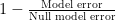
The result can even be negative if the prediction is harmful. So, I actually want to use

N(\hat{y}, y) = \max \{ 1 - \frac{ \sum (\hat{y}_i - y_i)^2 }{\sum (y_i - \bar{y})^2}, 0 \}

This value is 0 for a meaningless prediction, 1 for a perfect one.

I am calling it N for normalized error reduction. In fact, I’ve tried looking and asking around for a literature name. So far, I have not found one.

§

In the case of a positive correlation with no bias, this reduces to the R-squared between  and y , also known to as the explained variance.

I like to look at the results in plots like this one

base

On the x-axis, I have the underlying output, and on the y-axis, the cross-validated (or out-of-bag prediction) for each sample. I also plot the diagonal. In this case, the prediction is very good and there is only a little noise pushing points away from the diagonal.

§

However, it does not reduce the R-squared in a few interesting cases:

  1. The model does not predict at all.

null

Let’s say that your output cannot be explained by the input at all. To simplify things, let’s assume you don’t even have an input, just a set of outputs, {y1..yN} , which you predict as the mean in the training set.

If you use leave-one-out-cross-validation (LOOCV), then this null-prediction has perfect (negative) correlation with the input (see also here and here! Its R-squared is 1!

If you are using LOOCV, then you’ll probably see this and catch it, but it might slip by if your using 10 folds and you don’t have a lot of data and accidently report it as low-but-significant (with 100 datapoints, and uniformly sampled yi , the R-squared is different from zero, with p-value < 0.05, 90% of the time! 25% of the times, the p-value is below 0.0001)

  1. Reversion to the mean models.

mean_regression

This is an instance of where your model was oversmoothed.

In this instance, your model predicts in the right direction, but it underpredicts. However, if you just report R-squared of the prediction, you’ll lead your readers to think you can predict very well.

It’s not always the case that you could just have gone back and multiplied all your coefficients by a number larger than 1. It may be that to get the larger coefficients would imply that you would get noise in the output. This would not happen in traditional regression problems, but in p > n settings, where penalized regression is necessary, it can and does happen (maybe it is an indication to try relaxed lasso).

  1. Biased models

biased

If your models are biased, this naturally introduces a penalty. R-squared is invariant to addition (R2( + B, y) =  R2(, y) ), but N is not. In fact, if the correlation is positive,

R2(\hat{y}, y) = \max_B N(\hat{y} + B, y).

I most often see this when comparing human annotations. People have very similar trends, but one of the operators will consistenly report a lower value.

In some cases this may not matter and in others it will (if Matt always needs to give a bigger discount than John to get a sale, this does not mean that Matt and John are equivalent salesman).

§

In all of these, the R-squared is excellent, but I think it is overselling how good the prediction is, whilst N is more honest.

Some Links

1. The Tyranny of Formatting The vision for 2014 is off by at least 10 years, but compelling.

It is even worse when you realise that most of the time we are still reviewing these god-awful things in “manuscript format” where the reference are 10 pages down and the figures are split off from the captions &c. We pay the cost of formatting for submission and do not even get most of the benefits.

By the way, kudos to PeerJ on this matter:

We include reference formatting as a guide to make it easier for editors, reviewers, and PrePrint readers, but will not strictly enforce the specific formatting rules as long as the full citation is clear.

Styles will be normalized by us if your manuscript is accepted.

2. a href=”http://incubator.rockefeller.edu/?p=1256″>Want women in science, pay postdocs more

This is a probably wrong, but interesting, argument. (But, as a male postdoc, I’m all for the pay postdocs more.)

3. Euphemisms for non-significant

Probably the authors did a few manipulations to try to get the P value below 5% and failed. So, it is really non-significant.

4. Journalists have this expression that a story may be too good to check. It’s probably not true, but you just found such a good story that you don’t want to check before publishing.

Bioinformaticians should start talking about stories that are too good to debug. The Mad Scientist posts about exactly such stories

5. Are All Dictator Game Results Artifacts?

The answer is maybe.

A few interesting statistical facts

1. This one has gotten a lot of press recently, so it’s not so new; so bear with me if you’ve heard before:

For almost everyone, your friends have more friends than you do.

It remains true if instead of friends you substitute most other types of contacts: most of the people you follow on twitter have more followers than you do.

(The fact that most of your sexual partners had more sexual partners than you had is another reason to practice safe sex.)

2. I don’t know if this one has a name, but it’s about full busses, so we can call it the bus paradox: most people ride in busses that are fuller than average.

Let’s say that there are two types of bus: 25% of busses are completely full, the other 75% are empty (except for the driver). Then, riders will always experience full busses even if most busses are empty. This is true even if only 1% of busses are full, but the 25% number is a bit closer to reality. During rush hour, half the busses are very full (those going into town in the morning; out of town in the evening), even though the typical bus is pretty empty.

It comes up in other contexts, of course: restaurants are on average emptier than is experienced by the typical patron. It can even have public policy implications: the expensive publicly-funded football stadium is less used than the typical visitor realizes (“everytime I go there, it’s full, so it must have been a good investment” is wrong).

3. (This one is true in some countries in Europe): Most families only have a single child, but most children have siblings.

This is a variation on the bus paradox above. Let’s say 66% of families have 1 child, and 34% of families have more than 1. Then, most of the children are coming from that 34% of families with many children (at least 68 for every 66 single children, probably more) and they’ll have siblings.

Larger families are over-represented in the next cohort (in a country with a 1.2~1.3 birthrate, a family of 5 is four times over represented in the younger cohort).

What all of these have in common is that the fact that you are an observer makes you biased. They also remind us that it is a mistake to generalize too much from our own experience as the fact that we are observing something can itself be a confounding effect.